Tuesday, September 4, 2018

The Flattening Yield Curve -- Is It Different this Time?

September 4, 2018

The Flattening Yield Curve – Is It Different this Time?

 Back in mid-December 2016, the Fed started raising the federal funds rate by 0.25 of a percentage point per quarter. So, the federal funds rate has risen a cumulative 1.50 percentage points since then. When the Fed began these quarterly federal funds hikes back in mid-December 2016, the difference, or spread, between the yield on the Treasury 10-year security and the federal funds rate was 2.13 percentage points. In the week ended August 31, 2018, this spread had narrowed to 0.96 of a percentage point. Thus, since mid-December 2016 through the week ended August 31, 2018, the federal funds rate has risen by 1.50 percentage points as the yield on the Treasury 10-year security has fallenby 0.33 of a percentage point. The yield curve has flattened as a result of the combination of a risein short-maturity interest rates and a declinein long-maturity interest rates. Unless the economic landscape changes radically in the interim, the Fed is likely to raise the federal funds rate another 0.25 of a percentage point on this coming September 26. If the recent past is prologue, the spread between the Treasury 10-year security and the federal funds rate will narrow further.

I mention this narrowing in the spread between the yield on the Treasury 10-year security and the federal funds rate, or the flattening in the yield curve, because the behavior of the yield curve has the uncanny characteristic of presagingthe pace of real domestic demand for goods and services. That is, as the yield curve flattens, growth in real domestic demand slows with a lag. Conversely, as the yield curve steepens (the yield on the Treasury 10-year security rises relative to the federal funds rate), growth in real domestic demand increases with a lag. This leading relationship between the flattening/steepening behavior of the yield curve and the decreasing/increasing growth rate of real domestic purchases is shown in Chart 1 where the red bars represent the observations of the four-quarter moving average of the yield spread in percentage points and the blue line represents the year-over-year percentage changes in quarterly observations of the real gross domestic purchases (real gross domestic product plus imports and minus exports). The vertical shaded areas in the chart represent periods of business-cycle recessions. Notice that the spread between the yield on the Treasury 10-year security and the federal funds rate typically becomes negative priorto the onset of a recession. The exception to this was the recession that commenced in Q2:1960. Although the yield spread narrowed prior to the onset of this recession, it did not turn negative. In late 1966, the yield spread turned negative, but a recession did not occur. Although real gross domestic purchases did not contract, growth did slow precipitously. As I mentioned in a previous commentary, my former colleague at the Chicago Fed, Robert D. Laurent, did seminal research on the leading-indicator characteristic of the behavior of the yield curve. Rest in peace, Bob.


Chart 1


There is reason to believe that there is causalitybetween the behavior of the yield spread and the behavior of real domestic demand. The federal funds rate is the overnight interest rate on cash reserves traded among depository institutions (banks). The Fed controls the supplyof these reserves. To paraphrase the poet Joyce Kilmer, only the Fed can make reserves. Like any other price, the federal funds rate is determined by the interaction of the demand for reserves by banks and the supply of reserves controlled by the Fed. The Fed determines the level of the federal funds rate by altering the supplyof reserves relative to the demandfor reserves. If the demand for reserves should fall, all else the same, the federal funds rate would also fall. But if the Fed is targeting a particular level of the federal funds rate, the Fed would then reduce the supply of reserves to prevent the federal funds rate from continuing to trade at the lower level. (It is left as an exercise for the reader to explain what the Fed would do if the demand for reserves were to increase such that the federal funds rate were to rise above the Fed’s target level.)

Although the federal funds rate is determined by the Fed, the Fed’s influence on the levels of other interest rates free from credit risk is inversely related to the maturity of the interest-bearing security. The Fed attempts to signal its near-term intentions with regard to the level of the federal funds rate. For example, since its hike in the federal funds rate on June 13, 2018, the Fed has made known its intention to raise the federal funds an additional 0.25 of a percentage point on September 26, 2018. With less certainty, the Fed also has indicated that it will raise the federal funds another 0.25 of a percentage point on December 19, 2018. So, back in mid-June 2018, the yield on six-month maturity Treasury securities reflected expectations of an approximate cumulative increase in the federal funds rate of 0.50 of a percentage point by the end of 2018. But the Fed’s certainty as to how it will move the level of the federal funds rate wanes the farther into the future it peers. Financial market participants implicitly understand the Fed’s uncertainty as to how it intends to move the federal funds rate farther in the future and incorporate this uncertainty in their federal funds rate expectations. Therefore, future Fed intentions with regard to the level of the federal funds rate have minimal influence on the level of the yield on the Treasury 10-year security. 

Suppose the Fed starts raising the federal funds rate. In order to effect (spell check tried to change the “e” to an “a”) the increase in the federal funds rate, the Fed would have to slowdown the rate of increase in bank reserves. Because their marginal cost of funds has increased, banks would raise their loan rates. All else the same, the increase in bank loan rates would cause the quantity of bank credit demanded to slow. But suppose all else is not the same. Suppose that after a series of increases in the federal funds rate, businesses get more pessimistic about the demand for their product. This would induce them to slow down their demand for funds for the purchase of capital equipment. That is, the demand curve for credit would shift back. The fall in the demand for credit would put downward pressure on the structure of interest rates. Although the levels of interest rates on longer-maturity securities would fall, the federal funds rate is prohibited from falling because the Fed is assumed to have not lowered its federal funds target yet. So, a narrower spread between the yield on the Treasury 10-year security and the federal funds rate would result in a slowing in the growth of real domestic demand from a slowing in the quantity demanded of bank credit as a result of the increase in bank loan rates and an outright shift back in the demand for credit in general.

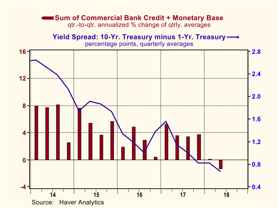
The slowing in the growth of real domestic demand followinga narrowing in the yield spread was shown in Chart 1. Chart 2 shows the tendency for the growth in the sum of depository institution credit and depository institution reserves at the Fed, a variant of, you guessed it, thin-air credit, to also slow after the yield spread has narrowed.
Chart 2
Back to present. Although the yield curve is flattening, the U.S. economy in the aggregate shows no sign of flagging. But remember, the behavior of the yield curve is a leadingindicator. There is one sector of the economy that typically begins to weaken before the aggregate economy does – housing. The data in Chart 3 illustrate that real residential investment (the red line) tends toleadthe overall economy (the blue bars) into and out of recession. The data in Chart 4 suggest that currently both home sales and housing starts have begun to weaken.
Chart 3

Chart 4
The stock market also is thought to be a leading indicator. Currently, the U.S. stock market is at or near a cycle and all-time high. This phenomenon is not inconsistent with a flattening yield curve. Although the relationship between the behavior of the yield spread and the behavior of the stock market leaves a lot to be desired, the data in Chart 5 show that a narrowing yield spread tends to leadthe decline in the stock market.

Chart 5


Discussions about the flattening yield curve abound of late. As a congenital contrarian, my primal instinct is to say that it is different this time. But from about 45 years of experience, I have come to realize that the phrase “it is different this time” represents the five most dangerous words in an economic forecaster’s lexicon. Perhaps a better guide for an economic forecaster is the translated French expression “the more things change, the more they stay the same”. Bob Laurent and I, mostly Bob, began doing research on the behavior of the yield curve in 1985 when I still was an economist at the Chicago Fed. In August 1986, I took a walk north on LaSalle Street to become an economist at The Northern Trust Company. Bob continued to do research on the yield curve and I continued to believe that he had found the Holy Grail of economic forecasting. The yield spread began to narrow with a vengeance in the second half of 1988, turning negative in Q1:1989 and remaining negative throughout the remainder of the year. As I recall, early in 1989 I started sounding the recession alarm. But the economy remained strong, much as it appears to be currently. Even though the Fed stopped raising the federal funds rate in mid 1989 and started cutting it in the second half of 1989, the yield on the Treasury 10-year security continued to decline and the yield spread remained negative. At the same time that the spread was narrowing and turning negative back then, the Treasury was cutting back on its issuance of longer-maturity securities. With no signs of a weakening economy and thinking that the lack of supply of longer-maturity Treasury securities might be the explanation for the continued decline in the yield on the Treasury 10-year security and the negative yield spread, I concluded that the signal being sent by the behavior of the yield spread was different this time. The recession started around midyear 1990! As I said, the five most dangerous words in an economic forecaster’s lexicon are “it is different this time”.

Unless the U.S. economy slows abruptly between now and the end of 2018 and/or unless some external economic or geopolitical crisis erupts that destabilizes financial markets, the Fed is likely to raise the federal funds rate a cumulative 0.50 of a percentage point by yearend. In all likelihood the spread between the yield on the Treasury 10-year security and the federal funds rate will narrow further from its week-ended August 31 level of 0.96 of a percentage point. Unless it is different this time, the Fed will have set the U.S. economy on a course for, at least, significantly slower real economic growth in 2019 and, at worst, a recession. In addition, the U.S. stock market is likely to perform considerably worse in 2019 than it has in 2018.

One of my former Chicago Fed colleagues, not Bob Laurent, used to joke that it was not too difficult to get paid two times your marginal revenue product, but three times was pushing it. Well, in my case, 3x0, 2x0, 1x0 – the answer is the same. It finally caught up with me. As much as I have enjoyed writing economic commentaries laced with data analysis, I have lost my access to the database of Haver Analytics unless I am willing to work for my marginal revenue product of zero. There are sources of free data, but nothing compares to Haver’s database in terms of user friendliness, timeliness and accuracy. So, this will be my final commentary. In the few sentient years I have left, I want to dedicate my time to my wonderful wife of 51 years, my children, my grandchildren, my friends, my community, music and sailing my 51-year old Pearson Commander sailboat on the sparkling waters of Green Bay. 

I want to thank all of you that have read my economic rants through the years. I want to especially thank one of my readers and former Northern Trust colleague, Nick Shukas. I first met Nick when he was a back office trade checker with Northern Futures. Back office workers are the unsung heroes of financial institutions. Without them, the show cannot go on. I suppose that just because Nick is an intellectually curious person with broad interests, he started reading the daily comments I wrote for Northern Futures. When Northern Futures closed its doors and Nick transferred to another back office position within Northern, he still read my commentaries. I guess Nick’s a fool for punishment, but he continued to read my commentaries after I retired from Northern and would call me to discuss economic developments. So Nick, thank you and I hope you still call.

Lastly, I am indebted to the management of Legacy Private Trust Company of Neenah, Wisconsin for giving me the opportunity to keep engaging in economic research since my retirement from Northern Trust in the spring of 2012. It has been my privilege to work with the Legacy people whom I hold in the highest esteem for their ethical standards and their trust company expertise. I believe that Legacy’s portfolio management team has a sound and unique approach to investing and I would not hesitate to recommend their services to anyone. Econtrarian out.

Paul L. Kasriel
Founder, Econtrarian, LLC
1-920-559-0375

“For most of human history, it made good adaptive sense to be fearful and emphasize the negative; any mistake could be fatal”, Joost Swarte

∆ + 6 = A Good Life


Monday, July 23, 2018

One Simple Policy to Simultaneously Strengthen Your Currency and Weaken Your Exports

July 23, 2018

One Simple Policy to Simultaneously Strengthen Your Currency and Weaken Your Exports

If a policymaker wanted to simultaneously strengthen the foreign exchange value of a country’s currency and weaken the country’s exports, that policymaker would be advised to impose tariffs on the country’s imports. This is the policy prescription I gleaned from reading Dartmouth College Professor Douglas A. Irwin’s 30-page monograph, “Three Simple Principles of Trade Policy”. The three principles of trade policy discussed in this intellectually powerful and compact publication are: (1) a tax on imports is a tax on exports, (2) businesses are consumers too, and (3) trade imbalances reflect capital flows. I have previously discussed, albeit in a less eloquent way than Professor Irwin, his third principle in my March 5, 2018 commentary, “The Expected Widening in the U.S. Federal Budget Deficit Has Trade Protectionist Implications”. In this commentary, I want to present Professor Irwin’s first principle, again less eloquently than he.

Suppose that the U.S. government imposes tariffs on say, Chinese goods. This will increase the price of those Chinese goods on which tariffs are imposed. The quantity demanded by U.S. residents of these Chinese goods will decrease. This will lessen the demand for Chinese yuan in the foreign-exchange market because fewer Chinese goods are now being purchased by U.S. residents. The fall in the demand for Chinese yuan will cause its foreign-exchange value to depreciate vs. the U.S. dollar. Alternatively, the foreign-exchange value of the U.S. dollar will appreciate, or strengthen, vs. the Chinese yuan. So, one Chinese yuan will now purchase fewer U.S. dollars, making the yuan price of U.S.-produced goods higher. The appreciation of the U.S. dollar will cause the quantity-demanded by Chinese residents of U.S.-produced goods to decrease. So, the net results of the imposition of tariffs by economy’s policymaker will be to cause that economy’s currency to appreciate in the foreign-exchange market and to cause that economy’s exports to decrease.

Professor Irwin makes the argument that “[e]xports and imports are inherently interdependent, and any policy that reduces one will also reduce the other.”  This suggests that an economy’s exports and imports should be positively and highly correlated. That is, if exports rise, so should imports. The chart below in which are plotted year-to-year dollar changes in the annual averages of nominal U.S. exports and imports from 1930 through 2017 contains data that are consistent with Professor Irwin’s argument. The correlation is positive between the dollar changes in U.S. exports and imports and its value is 0.92 out of a possible 1.00 high. 

In sum, if a policymaker’s goal is to simultaneously strengthen an economy’s currency in the foreign-exchange market and decrease the economy’s exports, then, by all means, the policymaker should impose tariffs on imported goods.

Paul L. Kasriel
Founder, Econtrarian, LLC
Senior Economic and Investment Advisor

Monday, July 16, 2018

Unless the Fed Changes Course, a 2019 Recession Collision Is the Most Likely Outcome

July 17, 2018

Unless the Fed Changes Course, a 2019 Recession Collision Is the Most Likely Outcome

The current level of the federal funds rate is 1.92%. As of June 13, 2018, the median estimate of Federal Open Market Committee (FOMC) members of the appropriate federal funds rate by the end of 2081 was 2.40%. This implies that the Federal Reserve has “penciled in” two more 25 basis point increases by the end of this year. If, in fact, the Fed holds this rate-increase course, I believe a recession will occur sometime in 2019. How do I know? The yield curve tells me so.

Cast your eyes on Chart 1, which shows you the behavior of the quarterly average percentage point spread between the yields on a 10-year Treasury security and 1-year Treasury security from January 1955 through June 2018. The shaded areas in Chart 1 represent periods of recession. Notice that every recession starting with the 1957-58 recession was precededby a narrowingin this yield spread to a degree that the value of the spread went negative. That is every recession starting with the 1957-58 one was precedednegativespread between the yield on the Treasury 10-year security and the Treasury 1-year security. During the January 1955 through June 2018 period, there was only oneoccasion when this negative yield spread gave an incorrect recession signal. That was from December 1965 through February 1967. During this period, the pace of real economic activity slowed sharply, but not sharply enough or long enough to result in being designated a recession by the arbiters of such, the National Bureau of Economic Research. To wit, in the four quarters ended Q2:1967, real GDP grew by 2.6%, down from 7.5% in the four quarters ended Q2:1966. As economic growth weakened, the Fed shepherded the federal funds rate down from 5.75% in December 1966 to 3.50% by June 1967, thus pulling the economy out of its nosedive. As of July 13, 2018, this yield spread stood at 0.48 percentage points. If the Fed were to hike the funds rate another 0.50 percentage points by yearend, the yield on the Treasury 1-year security were to rise by the same amount and the yield on the Treasury 10-year security were to remain the same, the Treasury 10-year – 1-year yield spread would move into negative territory.

Chart 1
The seminal and best research on the yield spread as an indicator of monetary policy and as a predictor of recessions was done by the Nikola Tesla of monetary economics, the deeply missed Robert D. Laurent. The logic behind the yield spread as an indicator of the degree of restrictiveness or accommodation of monetary policy is as follows. Assume that the Fed raises the federal funds rate in an environment in which the overall demand for credit is unchanged. In order to push the federal funds rate higher, the Fed has to reduce the supply of reserves (part of the monetary base) relative to the demand for reserves. So, all else the same, an increase in the federal funds rate entails a slowdown in the growth of the monetary base. Recall that the monetary base is – get ready – a component of thin-air credit. Ding! Ding! Ding! The federal funds rate is the base interest rate at which banks can obtain funds. As this base funding rate rises, banks will be induced to raise the interest rates at which they will loan funds. As bank loan interest rates rise, the quantity demanded of bank credit will decline. And what is the other and biggest component of thin-air credit? Bank credit. So, a Fed-induced rise in short-maturity interest rates relative to longer-maturity interest rates will lead to a slowdown in the growth of thin-air credit, which implies a slowdown in the growth of aggregate spending. Ah, the circle is completed. This is illustrated in Chart 2 in which is plotted the quarter-to-quarter annualized percent change in the sum of commercial bank credit and the monetary base vs. the quarterly average yield spread in percentage points between the Treasury 10-year security and the Treasury 1-year security. Notice that as the yield spread has been narrowing since 2014, growth in thin-air credit has been slowing.
Chart 2

But how can I be talking about a recession in 2019 when the economy seems to be bursting at its seams now? The Atlanta Fed’s Q2:2018 real GDP annualized growth forecast as of July 16 was a whopping 4.5%. If second quarter real GDP growth were, in fact,  to turn out to be 4.5%, this would represent the fastest quarter-to-quarter growth in real GDP the world has ever seen – that is, since the 5.2% growth in the third quarter of 2014 when you know who was president. Just as pride goeth before the fall, coincident indicators go up before a recession. In the past nine NBER business cycles, only three expansion peak quarters exhibited a contraction in real GDP. The largest peak-quarter real GDP growth was 4.7% (Q3:1981). The largest peak-quarter contraction was -1.7%. I suggest this country and western song title for economic forecasters – “How You Gonna See the Turn in the Road if You Keep Lookin’ Out the Side Window?”

With the real economy currently booming and the rate of consumer inflation trending higher, the Fed, in all likelihood, will not be able to constrain itself from raising the federal funds rate another 25 basis points at the end of its September 25-26 meeting. If the Fed holds its fire thereafter, the U.S. economy just might be able to avoid a 2019 recession, although real economic growth will have slowed to a crawl. If the Fed goes ahead an raises the federal funds an additional 25 basis at its December 18-19 meeting, batten down the recession hatches in 2019. 

Paul L. Kasriel
Founder, Econtrarian, LLC
Senior Economic and Investment Advisor

“For most of human history, it made good adaptive sense to be fearful and emphasize the negative; any mistake could be fatal”, Joost Swarte

∆ + 6 = A Good Life


Monday, April 16, 2018

Thin-Air Credit Growth Slowdown Augurs Poorly for 2018 Domestic Demand Growth

April 16, 2018

Thin-Air Credit Growth Slowdown Augurs Poorly for 2018 Domestic Demand Growth

A majority of my readers (two) have asked me to update the discussion about the behavior of thin-air credit or a variant thereof, namely the sum of commercial bank credit (loans and securities) and the monetary base (bank reserves at the Fed and currency). To paraphrase the motto of the former iconic Chicago department store, Marshall Field’s, give the customers what they want. To give the “customers” a preview of what they are going to get, let me state that thin-air credit growth has slowed to a rate that is low both from a long-run and short-run perspective. The slowing growth in nominal thin-air credit in conjunction with the acceleration in consumer price inflation has negative implications for growth in real U.S. aggregate domestic demand in 2018. In turn, if growth in real aggregate domestic demand “surprises” on the downside in 2018, then the Fed is unlikely to hike the federal funds rate the full 50 basis points this year that the market currently expects. Alternatively, if the Fed is hell-bent on raising the federal funds rate 50 basis points or more over the remainder of 2018, it would be sowing the seeds of a 2019 recession unless there is an acceleration in the growth of nominal and real thin-air credit. An acceleration in the growth of thin-air credit would be unlikely in the face of a rising federal funds rate.

As shown in Chart 1, year-over-year growth in thin-air credit has trended lower from its 9+ percent observations from Q4:2013 through Q3:2014. As of Q1:2018, year-over-year growth in thin-air credit was 2.7% -- low growth in terms both of a long-run and short-run historical perspectives.
Chart 1
Plotted in Chart 2 are the year-over-year percent changes in the quarterly observations of, again, thin-air credit (the sum of commercial bank credit and the monetary base) along with the percent changes in each of its major components – commercial bank credit and the monetary base – by themselves. The slowing growth in thin-air credit (the red line) in 2015 and 2016 was primarily due to the Fed’s cessation of quantitative easing (QE), i.e., large outright purchases of government securities and quasi-government mortgage-backed securities, which resulted in the year-over-year contractions in the monetary base (the green bars). Surprisingly, at least so to me, was the rebound in year-over-year growth in the monetary base in the past three quarters inasmuch as the Fed had started to reduce, albeit marginally, its outright holdings of securities and the Fed had been hiking the federal funds rate. Starting in 2017 and continuing through the first quarter of 2018, growth in commercial bank credit the blue line) has been trending lower, which has restrained the growth in thin-air credit.
Chart 2
Not only has growth in nominal thin-air credit slowed, but so, too, has growth in real thin-air credit, i.e., nominal thin-air credit deflated by the Consumer Price Index (CPI). In Q1:2018, the year-over-year percent change in real thin-air credit was just 0.5%. The importance of this is that there is a relatively high correlation between the year-over-year growth in real thin-air credit and real final sales to domestic purchasers. Starting in Q1:2011, the correlation coefficient between the year-over-year percent changes in real final sales to domestic purchasers and the year-over-year percent changes in real thin-air credit, advanced two quarters, is 0.68 out of maximum possible 1.00. This is shown in Chart 3.


Chart 3
As one of my readers (the other one?) has correctly pointed out, correlation does not necessarily imply causation. However, when I tested the lead-lag relationships between these two series, I found that the correlation coefficient was highest when thin-air credit growth leads growth in real final sales to domestic purchasers by two quarters. When growth in real final sales to domestic purchasers leads growth in real thin-air credit, the correlation coefficient declines. This does not prove that growth in thin-air credit causes growth in real final sales to domestic purchasers, but it sure does support the hypothesis.

In sum, the slowing in the growth of both nominal and real thin-air credit augurs poorly for the growth in aggregate domestic demand in 2018. But wait, won’t this year’s federal tax cuts stimulate demand? Not unless the resulting increased deficits are financed with the creation of thin-air credit. (See my January 22, 2018 blog post “No Sugar High from Tax Cut Unless the Fed and the Banking System Provide the Sugar” for an explanation of this). And, so far, at least, growth in thin-air credit has slowed, not accelerated. The market currently expects the Fed to hike the federal funds rate at least another 50 basis points this year. If I am right that growth in domestic demand slows this year, a further 50 basis point increase in federal funds rate might be sowing the seeds of 2019 recession. Available data, such as annualized growth in Q1:2018 nominal retail sales of 0.8% vs. 10.4% in Q4:2017, suggest a slowing in the growth of Q1:2018 final sales. Rumor has it that the Fed believes this slowing in aggregate demand growth is mainly due to “faulty” seasonal adjustment factors. The Fed ought to take a look at the behavior of thin-air credit growth before dismissing the weakness in first quarter final sales growth.

Paul L. Kasriel, Founder, Econtrarian, LLC
Senior Economic and Investment Advisor
“For most of human history, it made good adaptive sense to be fearful and emphasize the negative; any mistake could be fatal”, Joost Swart                                            ∆ + 6 = A Good Life


Sunday, April 1, 2018

As of this Past Fourth Quarter, the S&P 500 Remained Relatively Cheap

April 2, 2018

As of this Past Fourth Quarter, the S&P 500 Remained Relatively Cheap

Now that the first quarter of 2018 has just ended, what could be more fitting than to look back at the relative valuation of the S&P 500 stock index as of last year’s fourth quarter? After all, isn’t that what we economists do best, look back? This commentary is an update to my November 29, 2017 commentary, “The S&P 500 Is Not Expensive According to the Kasriel Valuation Model”. Before reviewing my methodology for estimating the over/under valuation of the S&P 500 stock market index, let me give you the Q4:2017 results upfront. According to my methodology, the S&P 500 index in Q4:2017 was overvalued by 7.4% compared with a revised 4.1% overvaluation in Q3:2017. Given that the median value of over/under valuation of my methodology in the period Q1:1964 through Q4:2017 was 35.5% overvaluation, the 7.4% overvaluation of the S&P 500 in Q4:2017 seems trivial. The continued low level of the corporate bond yield is the principal factor keeping the S&P 500 from being more materially overvalued.  Now for the important disclaimer. My relative valuation methodology involves only three observable variables – smoothed annualized reported earnings of corporations included in the S&P 500 equity index, the level of the corporate BAA/A-BBB bond yield and the actual market capitalization of the S&P 500. My methodology does not take into consideration expectations of corporate earnings or of bond yields. Nor does it take into consideration exogenous “shocks” including but not restricted to the likelihood of changes in the U.S. tax code, of geopolitical conflicts or of the imposition of U.S. trade protectionist policies. Of course, if I had a high degree of certainty about these exceptions to my “model”, I would be an extremely wealthy person and would not be inclined to share my “wisdom” with you!

To refresh your memory about my methodology, I calculate a quarterly theoretical market capitalization for the S&P 500 by discounting (dividing) smoothed annualized reported earnings of S&P 500 corporations by the yield on the lowest-rate investment-grade corporate bonds (BAA/A-BBB). I then compare my calculated theoretical market capitalization value with the actual market capitalization value. The percent of over/under value for the S&P 500 is calculated as follows:

((Actual Market Cap/Theoretical Market Cap)-1)*100

The technique I use to smooth reported corporate earnings is some high-falutin’ econometric technique called the Hodrick-Prescott filter. (Edward Prescott is a Nobel Prize winner in economics.) This smoothing technique is designed to remove the cyclical variation from a trending series. Another economics Nobel Prize winner, Robert Shiller, uses a 10-year moving average to smooth the S&P 500 price-to-earnings ratio in his stock market valuation research. He calls this the cyclically-adjusted P/E. It seems to me that a 10-year moving average is an arbitrary tool to use to remove the cyclical component from a time series. Why not use a technique specifically designed to remove cyclicality? While I’m on the subject of the Shiller cyclically-adjusted P/E, aside from the arbitrariness of using a 10-year moving average, a P/E in isolation tells you nothing about the stock market’s over/under valuation without taking into consideration the level of bond yields. A low P/E could be an indication of an overvalued stock market if the bond yield is relatively high. Conversely, a high P/E could be an indication of an undervalued stock market if the bond yield were relatively low, as has been the case for several years now.

Let’s go to the data. Plotted in the chart below are the quarterly observations of the percent over(+)/under(-) valuation of the S&P 500 calculated with my methodology discussed above. Also plotted in the chart are quarterly observations of the year-over-year percent change in the S&P 500 equity index. If my methodology has any legitimacy, there should be a negative correlation between the over/under valuation variable and the year-over-year percent change in the S&P 500 index. That is, if the S&P 500 is overvalued as calculated by methodology, then I would expect the S&P 500 equity index to be increasing at a slower rate or even declining. I found that the highest absolute value of a negative correlation coefficient, minus 0.20, is obtained when the over/under valuation is advanced by five quarters in relation to the year-over-year percent change in the S&P 500 index.  (With the low value of the correlation coefficient at minus 0.20, there obviously is a lot missing from this “model” in terms of explaining the behavior of the stock market, as I admitted at the outset.) So, the last data point plotted in the chart for the over/under valuation variable at Q1:2019 is actually the observation for Q4:2017 (advanced five quarters). The median value of over/under valuation is 35.5%. So, interpreting whether the S&P 500 is over or undervalued, it is better to look at the percent over/under valued in terms of 35.5% rather than zero.


As of Q4:2017, then,  my “model” indicated that the S&P 500 was overvalued by 7.4% -- a relatively low reading in comparison to the 35.5% median value for over/under valuation during the entire sample period. The yield on the BAAA-BBB corporate bond yield appears to have averaged about 4.45% in Q1:2018, up about 18 basis points from its Q4:2017 level. The market cap of the S&P 500 was about $22.5 trillion. If annualized smoothed S&P 500 reported earnings remained at their Q4:2017 level of $906.7 billion, then the S&P 500 would be 10.4% overvalued in Q1:2018 – still well below the median overvaluation of 35.5%. What if the BAA corporate bond yield had risen 100 basis points in Q1:2018 to a level of 5.27% and annualized smoothed reported S&P 500 earnings remained the same as they were in Q4:2017. In this case, in relation to the actual S&P market cap in Q1:2018, the S&P 500 would have been 31% overvalued. Of course, if the bond yield had risen by 100 basis point in Q1:2017, it is likely the actual S&P 500 market cap would have been significantly lower, and thus, the overvaluation of the market would also have been lower.

In sum, given S&P 500 annualized smoothed reported earnings and the current level of corporate bond yields, the S&P 500 stock market does not appear to be excessively overvalued. The continued low level of corporate bond yields is the principal reason that the overvaluation of the S&P 500 remains low in an historical context. Corporate earnings are growing, but at a subdued pace. In full disclosure, my portfolio is devoid of equities even though I do not believe that the S&P 500 is grossly overvalued.  Why? Because of those other factors that I mentioned earlier in this commentary. As evidenced by the quote I put at the end of my commentaries -- for most of human history, it made good adaptive sense to be fearful and emphasize the negative; any mistake could be fatal – I am congenitally risk averse. The S&P 500 equity index exhibited increased volatility in Q1:2018. I believe that this increased volatility was due primarily to exogenous “shocks” mentioned earlier in this commentary rather than the behavior of corporate earnings and/or corporate bond yields.

Paul L. Kasriel
Founder, Econtrarian, LLC
Senior Economic and Investment Advisor

“For most of human history, it made good adaptive sense to be fearful and emphasize the negative; any mistake could be fatal”, Joost Swarte

∆ + 6 = A Good Life